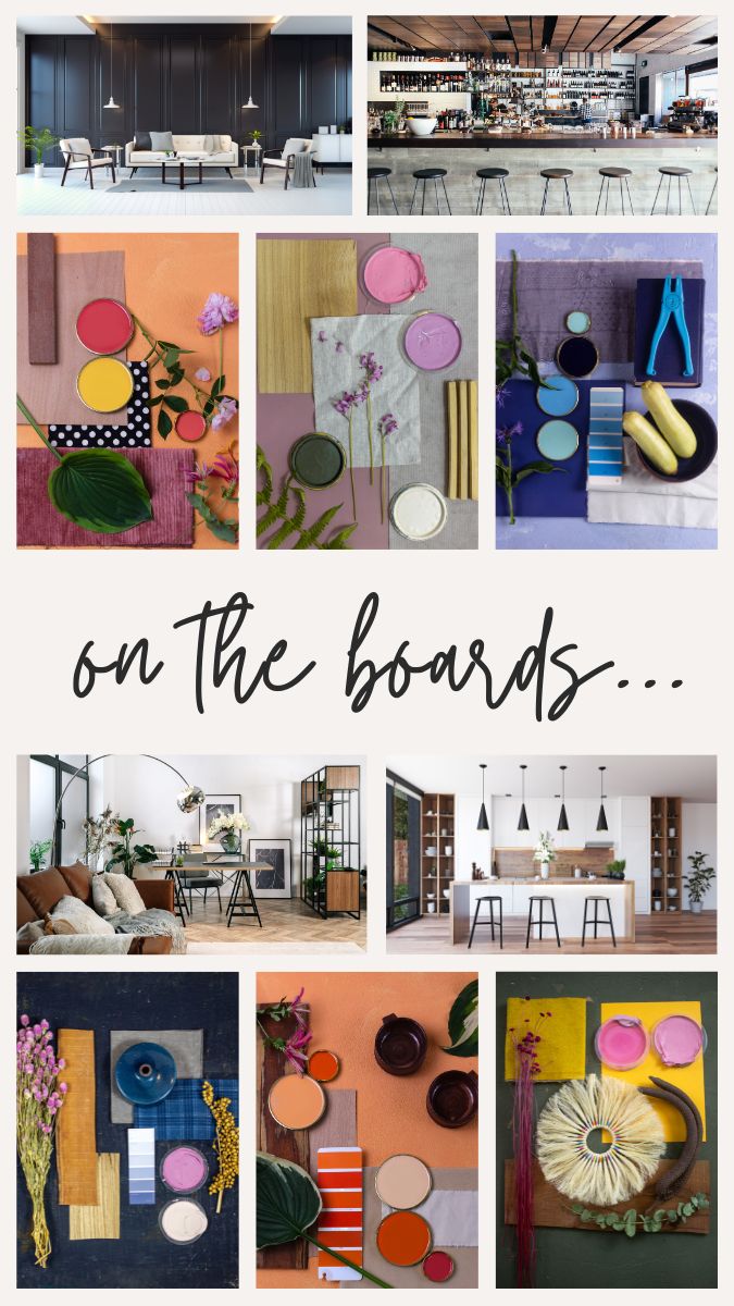
Color in Industrial Design
Color can have a significant impact on how we perceive the size and proportions of objects. One example that can be used to illustrate the relationship between color and the scale is an industrial design decision that many of us interact with daily: cars and trucks.
Let’s take a pistachio green Fiat 500 – the color works well because it complements the smaller size and playful design of the car. The light, pastel shade adds to the car’s overall charm and uniqueness. If the same color were applied to a larger vehicle like a Suburban, it might not have the same effect. The color could potentially be overpowering on that vehicle. This is why the designers for Chevy select neutrals and toned primary colors for a vehicle of a larger stature.
Creating Balanced Interior Spaces
This principle can be applied to other design contexts as well, including interiors. When selecting colors for walls or partitions in an office building, for example, it’s essential to consider the scale of the space. Extremely saturated colors applied across large areas can create a visually overwhelming effect, potentially making the space feel smaller or more chaotic. It’s crucial to strike a balance and choose colors that are appropriate for the scale of the environment.
Beyond “Pops of Color” – The Anthropomorphic Scale Concept
While the term “pops of color” may seem overused, it signifies a deeper design concept – color at an anthropomorphic scale. This concept explores how color can influence perceptions of size and proportions for a specific audience – humans. It also considers the scale at which humans interact with color based on their proximity to color. This is similar to the concepts described in Edward T. Hall’s theories of Proxemics in relation to human-to-human interaction. Empowered by this understanding, designers can make calculated choices that elevate aesthetics and functionality. By leveraging color effectively, we can create spaces that tell unique stories.